
Building your first responsive website can feel both exciting and overwhelming. With so many devices ranging from smartphones to desktops, it is crucial that your website looks and functions well on all screen sizes. Responsive web design ensures your website adapts seamlessly to different devices, providing a smooth user experience. If you are new to web development, understanding responsive design is an essential first step, as it affects usability, accessibility, and search engine ranking. Resources such as UXPin’s responsive design guide offer comprehensive insights into how flexible layouts and media queries work together to create adaptable websites.
Table of Contents
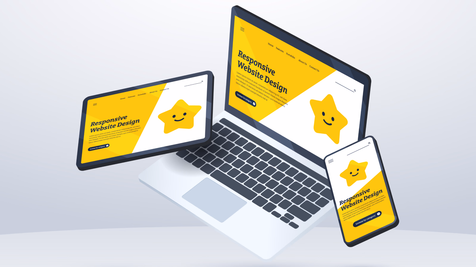
What is Responsive Website Design and Why It Matters
Responsive web design is built around three main principles: flexible grids, flexible media, and CSS media queries. Using a flexible grid system allows your layout to scale proportionally to the screen size, while flexible media ensures images and videos adjust smoothly. Media queries let you apply different styles depending on device width, helping your content display correctly on mobile, tablet, or desktop. According to BrowserStack, responsive design is not just about aesthetics but also about improving accessibility and overall user experience, which search engines now prioritize.
Setting Up the HTML Structure
The first step in creating a responsive website is setting up a clean HTML structure. A semantic approach, using elements such as <header>, <nav>, <main>, and <footer>, enhances accessibility and SEO. Including the viewport meta tag in the <head> section ensures your website scales correctly on mobile devices. Tutorials like Djamware’s beginner guide demonstrate how a proper HTML foundation simplifies the application of CSS for responsive layouts.
Styling with CSS and Flexible Layouts
Once your HTML is in place, CSS handles the styling and layout of responsive website. Using relative units such as percentages or viewport-based measurements instead of fixed pixels creates a flexible layout that adapts to different screens. CSS Flexbox and Grid modules are highly recommended for modern responsive design because they allow you to organize content dynamically. Tutorials on TuteeHub show how these tools can create a responsive grid and align content efficiently across devices. Additionally, setting images to a maximum width of 100 percent and using auto height ensures that media scales naturally without distortion.
Using Media Queries Effectively
Media queries are essential for customizing layouts at specific breakpoints. For example, a navigation bar that appears horizontal on desktops can be transformed into a vertical stack or collapsible menu on mobile devices using CSS. The mobile-first approach, which designs for smaller screens first and then scales up for larger devices, ensures optimal performance and usability. Learning about best practices in media queries from BrowserStack can help beginners structure their code more efficiently and maintain consistency across devices.
Making Media and Content Flexible
A fully responsive website is not just about grids and breakpoints. Media such as images and videos, typography, and navigation menus also need to adapt. Using the <picture> element or srcset attribute for responsive images ensures optimal loading and clarity. Flexible typography using em, rem, or % units makes text scale naturally across devices. For mobile users, touch-friendly interactions and adaptive navigation improve usability. According to GeeksforGeeks, flexible media and thoughtful content presentation are key to delivering a professional, responsive website experience.
Testing and Iterating
After building your site, testing it across multiple devices and browsers is crucial. Use browser developer tools to simulate different screen sizes and orientations. Testing on real devices is even better, as it reveals issues that simulators might miss. Iteration is important; fixing layout shifts, horizontal scroll, or distorted images ensures your site is polished and functional. Testing guides from UXPin offer strategies for beginners to validate responsiveness effectively.
Conclusion
Creating your first responsive website may seem challenging at first, but mastering semantic HTML, flexible CSS layouts, media queries, and responsive media handling will lay a strong foundation for future projects. Beginners who follow these steps can build websites that work seamlessly on any device, improving user experience and search engine performance. Once comfortable with these techniques, adding interactivity with JavaScript or using frontend frameworks becomes much easier. Learning the fundamentals thoroughly ensures that your sites remain accessible, scalable, and ready for the evolving web landscape.
Also Check Powerful and Essential Web Development Tools – Guide – 2025
1 thought on “Building Responsive Website – Comprehensive Guide – 2025”